
This is an entirely factual breakdown of the making of "Originally a Moose," one of my illustrations. The aim of this piece is to provide information on my illustrating process to those who may be interested. If you're not interested, I'd suggest skipping this article entirely.
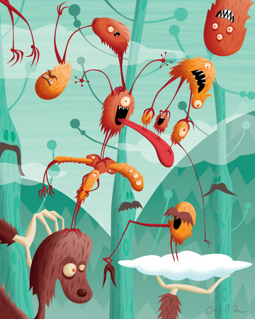
The piece being discussed, "Originally a Moose:"
**DISCLAIMER**
What you are about to read is not a tutorial. If you're new to vector illustration, it may be mildly enlightening, but I'd look elsewhere if you're you're looking to get educated. In breaking down my process, I'll get into technical details, but I'm not really interested in teaching; other people on the web do a much better job of it. Also, I'm pretty opinionated when it comes to digital art and, well, life in general, so consider yourself warned
Part 1: Why vector art?
I've been working in graphic design in some capacity for a decade at this point and vector illustration has been at the core of much of my professional work. I realized about five or so years ago that I'd become better at drawing vectors than I am drawing or painting conventionally. I also REALLY enjoy the process and I think I personally find it more satisfying than conventional methods. GASP! I'm a heretic! Burn me at the stake while you discuss your love of Mark Ryden and sip your vente lattes.
All methods have their pluses and minuses and, honestly, I really don't care how something's produced as long as the end result looks good and no one's harmed in the process. That said, I can't tell you how many cringes and looks of disbelief I've gotten when I've told other artists how I work. It's pure snobbery, in my opinion, but to each their own. The snobs actually bother me less than the "it's digital so it must be easy" crowd. I'd say a good 50% of the non-artists I've shown my work to have been shocked when they've seen me draw conventionally. "You can draw? I thought you were just good at computers." Swear to God, this happens all the time and it bugs the crap out of me. When I mention that I work digitally, they envision me pressing some magic button that draws my images for me. Anyone who's worked with vectors will tell you that it's just as difficult if not at times more challenging and time-consuming. Unless, of course, you're using Illustrator's Live Trace function to outline something; you're just giving the rest of us a bad name (I just lost half my audience).
Now that all of that's out of the way, here's why I love vectors so much:
1. Mixing and changing colors is super fast and nearly effortless.
2. Nearly-endless levels of Undo help iron out mistakes.
3. Every element is endlessly "wet" and mutable. Nothing's fixed until the image goes to print.
4. The lines and curves can be smoothed to give a clean, precise look that appeals to me.
5. Scalability without degradation!
Part 2: Concept
I usually come up with most of my ideas while I'm running. Yes, running. If you've seen my work, you know it's can be a bit absurd, surreal, and sometimes just wacky. Running allows me to meditate on different ideas and draw them in my mind. No illicit substances are ever involved. Ever. People always assume I'm on all kinds of drugs because I create what they consider "trippy" illustrations. I'm not really interested in putting anything into my body that makes me dumber (and there goes the other half of my audience).
After I have the initial idea, I usually try to do some rough sketches with pencil and paper to flesh out the ideas. When people say, "It's all in my head, man," it rarely ever is. Getting something -- anything -- on paper really helps firm up my concepts and, if nothing else, points me in a better direction. Here are some of the crappy sketches that came in the days before I sat down to complete the piece this article relates to:
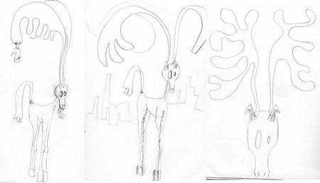
Yep, I know, they suck, but quality isn't the point when you're sketching ideas. The idea is ideas and, even though the finished product in this case looks absolutely nothing like any of these God-awful sketches, I wouldn't have produced it without them.
Part 3: Killing your what?
When I was in college, one of our teachers always talked about "killing your babies." It's a horrible term, one I won't use, but the concept is a good one. The idea is that you're willing to take even your most treasured ideas and toss them in the trash if they're working against your goal. In the case of my moose, it wasn't going where I wanted to and it was stifling my creativity, so I decided to change course a bit. I thought, "What if the antler were made entirely of monsters?" and went from there. I actually started drawing swoopy, flowing antlers in Illustrator and when I began covering them with monster shapes, I knew I was onto something better.
Part 4: Let the vectors begin!
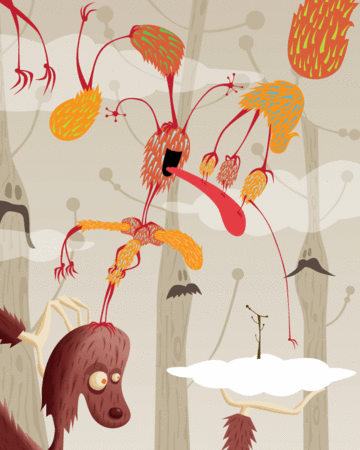
The most difficult/depressing part of creating any artwork for me is the beginning. When I'm working with vectors, I always start by drawing and positioning brightly colored shapes, basically the outlines of my finished forms. Usually -- but not always -- I hold off on shading, textures, and color choices until I've got a pretty good idea as to what the composition is going to be. It's really hard to do because color and shading are for me the most deeply-satisfying parts of my process and I often doubt myself until I start those finishing touches. Here's the good ol' moose after the outline/composition stage:

The colors are sort-of close to the finished product. I use bright, garish colors for this part of the process because they help me identify regions of my illustration and sometimes can help ease the final coloring process when used in conjunction with Select->Same, one of the most rudimentary and useful of all Adobe Illustrator functions (more about that later).
One other thing I should mention that goes along with this part of my process is that I use layers -- a lot of layers -- to keep my images organized. I label each layer with a clear, easy-to-understand name (like "moose"). Not only does this help when you're weeding through a complex vector piece trying to find a certain element, it also allows you to hide, lock, or isolate an area if necessary. Usually all of my layers are locked except for the one I'm working on. Here's an example, with a ton of sublayers hidden in the "monsters-right" layer:

What a hypocrite -- I didn't label "Layer 11." Actually, all it contains is my signature, so it doesn't really matter anyway.
Part 5: The good stuff, the fun stuff, the stuff that takes me forever.
Colors
After all of the basics are complete, I get to work on the details, my favorite part of drawing. I didn't go to art school, but I've taken a few art classes and one of my best and favorite teachers taught me an invaluable lesson: don't focus on one part of the image; move around and keep balance within the work up until the end. I cannot tell you how much that one tiny piece of advice has helped me over the years. When I move past the basic composition/outline stage of my illustrations, I try to build up the rest of the work in unison without focusing too hard on any one region. It not only allows me to see the entire piece come to life, it also helps my psyche deal with the process. Like I mentioned earlier, looking at the beginning phases in which the work looks patch-work and unfinished is a bit demoralizing for me. Maybe I need a therapist.
Back to the process, this is when I firm-up my color choices, usually opting for toned-down versions of my original, super-bright colors. I try not to "spike" any of the CMYK sliders and I usually use a little bit of all three "colors" (cyan, magenta, and yellow) in each of my mixes to help give the blends a more organic feel. I also try to avoid the stock, pre-blended color swatches (even though the CS2 stock swatches are pretty excellent). Of course, there are always exceptions, and in this piece I used a stock orange-yellow from the CS3 stock swatches because it just worked with the final piece. I also keep one of the swatch folder sets that came with CS3 for what I call "key colors," colors I use specifically to isolate regions of an image that I'm going to change with the "Select->Same" function. Here's a snap of the moose's swatch palette (it may look a little off due to the fact that it's RGB now):

Shading
As far as shading goes, there are tons of different techniques and approaches available, but I use a combination of just a few: gradients, transparency/blending mode set to multiply, and masked feathered objects. I think my shading techniques are probably where I diverge most from other vector artists, but I could very well be wrong. After reading this, someone's going to comment and tell me how I could do everything with Gradient Mesh. I really, really dislike Gradient Mesh and I wouldn't recommend it to my worst enemy. Yes, I've used it. Yes, I understand how to use it. It's counter-intuitive, the points used in the mesh have an entirely different feel and set of rules than do the standard AI points, and I really don't like the color blends it creates. If you like to use it, more power to you, but PLEASE, don't try to convince me. I despise the mesh.
First I choose a light source. It doesn't even have to be present in the image, it just needs to provide direction for the light/shading. After that, I usually start by applying a subtle gradient to one of the objects I'm looking to shade. By subtle I mean a low-contrast gradient. High-contrast, extreme gradients usually result in cheap, amateurish images. Of course they're necessary and useful sometimes, but as a general rule, I avoid them. After I apply the gradient, I deepen the dark, shaded area with objects in the shape of the shadow I want to create. I usually use the same fill color that the original object has and then set the transparency/blending mode to multiply. This darkens the area. Then, depending on the type of shade I want (soft or hard edges), I feather the edges of the object using Effect->Stylize->Feather. Sometimes I create two or three of these shade objects to enhance the effect. After this, I copy the original base object, paste it on top, and create a clipping mask. Sound confusing? Here's a step-by-step diagram:

Texture
Sometimes vector images look too clean and digital. Different people have different methods for texturizing or dirtying their images. My preference is to keep every element a vector. Also, I enjoy the challenge of coming up with new methods for approximating texture within the confines of vector-based work. I'm only going to use one example, that of the "fur" I've applied to my creatures in this illustration, to explain how I approach texture.
This is where the blessed "Select->Same" comes into play. I use "Select->Same" A LOT. For this image, I created an art brush shaped like an elongated triangle. I made it 100% black, allowing it to take full advantage of the "tint" function AI allows you to apply to your brushes. by doing this, your brush inherits the color you choose for your stroke. I then draw in my textural elements using the brush tool. I use what I call "key colors" depending on the direction each triangle is facing. I do this because I intend to replace the colors with multiplied gradients to give the textural elements a blended-in look. Here's what this image looked like after I drew in the majority of the garishly-colored texture:
You should notice that each "direction" is given it's own color. First, I select all of the newly-colored triangles them (Object->Expand Appearance), and get rid of the leftover empty paths with the clean-up function (Object -> Path -> Clean Up). Then I select one of the triangles of a specific color, do a Select->Same Fill Color, and apply a predetermined style containing a directional, multiplied gradient to the an entire direction all at once! Basically I create one complete triangle for each direction first and add a new style swatch containing their individual attributes (fill color, gradient direction, transparency, blend mode) to the Styles palette. Here's a peek at my Styles palette:

Part 6: Wrapping Up
Aside from all of the color, shading, and texture business, I also add in details (like the eyes, mouths, etc.) and make any final adjustments I feel are necessary. Originally, I had a baby tree sprouting from the cloud former-moose was holding. I changed this to the mustachioed little creature that presently sits atop the cloud. Also, I changed the background color pretty drastically because I didn't think the monsters "popped" enough against the grey-brown background. In all, I worked for a whole day on just the details to get this where I wanted it. It's the happiest I've been about something I've done in a while. Here's a look at the finished product one last time:
Hope this was somewhat enlightening and only mildly to non-offensive. Once again, this isn't a tutorial and I never intended it to be, so please, please, don't ask me to delve too deep into technical specifics unless you're willing to come to Los Angeles and buy or cook dinner for my wife and me. I'm always happy to help people out, but there's some great information on the Internet that's written by extraordinarily-talented people who have put the time and effort into creating exactly what you're looking for in much greater detail than I have the time or patience for. In fact, here's a phenomenal link with tons of great tutorials (they were even nice enough to include two of my pieces in their "best in practice" section!): http://www.noupe.com/tutorial/vector-illustration-60-illustrator-tutorials-tips-and-best-practices.html
Thanks for stopping by! More of my work here, here , and here.
Hey Chris, thanks so much for the excellent breakdown here. For someone who has little-to-no experience with computer graphics, yet is very interested in eventually working more with them, this was indeed enlightening. I really enjoyed reading this as well, seeing things from your personal perspective and experience! I think it is unfortunately going to be a while before computer-based artists get the proper respect they deserve. The "magic button" part was my favorite, because that's how some people still think about art made using computer software tools. It's ignorant and primitive thinking, even hypocritical considering how we communicate and do things every day, that are very "real", while using computers. It hit me many years ago, when I was in college, and taking up some painting courses, and doing quite well. I remember getting into a heated debate about the "realness" of computer-made art vs oil painting. While I'm very much an advocate and fan of computer art (for lack of a better term), I was on the other side of the fence back then. A friend of mine put me in my place when he mentioned how much of the music I listen to and love is made using computers (I've always been big into electronic music). It was something that I should have realized already at the time, and it made me stop and think, not recognizing those parallels initially. As I've seen such art evolve and advance over the years, I've embraced it more and more, and looking back, I'm now a big fan of lots of the old-school computer-based art. The bottom line is, it's art (or it's music) no matter what the tools! You've used your brain, your creativity and your abilities to compose and create and the end results (as seen with this work) are fantastic.
On a side note, I like how you mentioned how running helps you generate ideas. I too have never advocated or needed the use of outside, mind-altering substances to get ideas. For me, walking, biking, or listening to music has been my "drug". I think it was Steven Speilberg who mentioned, in an interview, how he always keeps a pad and paper nearby while driving, since most of his best ideas materialize while he's on the road. In the meantime, good for you, going in a completely different direction from the initial moose idea. I did the same with mine this week (was originally going to draw a girl with a big, poofy fro) and scrapped the first couple of drawings.
As for the complexity of this particular work, I think it has just the right balance of simplicity and detail. Complexity doesn't necessarily mean better, and again, this is just right (and a fine composition, to boot).
So, keep up the excellent work and don't let the snobs and naysayers discourage you, because they obviously don't know what they're talking about. Sure, lots of people do make art with computer software that is lazy and falls under that whole "push the button" category. But there are also lots of crap drawers and painters too who aren't any better for using so called "real" tools.
Thanks for your extraordinarily-constructive comment, Steve. It's funny, in college even I had a mild aversion to work originating from computers. Then, during my senior year at Penn State, I found Photoshop (or maybe it found me) and it pretty much flipped my world upside-down. I actually regret not encountering it soon as it seems to have altered the course of my life in a big way.
OHHH, I get it... it's a moose.
I, too, have to sketch everything out on paper, sometime I even go as far as scanning my sketches in and HAND drawing my vectors over my scan. (never, ever, ever using the auto trace. it just cheapens the whole process.)
Thanks for the insight into your creative process. Without a doubt, I have to agree with you about the gradient mesh tool..... it blows.
Goodness, that's allot of work you've done -- both in making the picture and in making this exposé on how yer did its. Good job, yo.
Dave: It seems as if a lot of vector artist trace their sketches, which isn't a big deal, but with the advent of the easy-to-use Live Trace, every joker with a pirated copy of CS3 seems to be auto-tracing every photo they like, adding a gradient background and calling it art. I've seen arguments claiming it as a "good way to learn vectors." It's just as asinine as it is lazy. Also, it's good to know we share the same opinion of Gradient Mesh.
Alex: Thanks, yo!
wE HAVE SOMETHING IN COMMON!
i KILL BABIES TOO!!!!
You have outdone yourself sir!!! And superb breakdown of the process. I continue to applaud those that understand greatness involves work and refinement...even sometimes work that appears as a happy accident often is rooted in the process working internally...thumbs up from here!
Perfect color use and such a great sense of whimsy!
Chris, I bow down to you. This was an absolutely awesome breakdown of your work. Thank you so much for sharing it. And I love how you kept your original sketches. Whenever I change paths, everything gets completely erased, demolished, buried and burned.
I only took one art class in college, and drawing is just a hobby for me. But I have Illustrator CS3 and am trying to play with it more. So your excellent article was an eye-opener to me. I am in complete awe with people such as yourself who can manipulate digital objects and colors like that. I know that in many ways, it can be more difficult and time consuming than traditional media.
Your work is absolutely inspiring. THANK YOU!
How can you not like Gradient Mesh? You probably think Short Circuit is better'n Heartbeeps, too. Maybe you should read up on how to use your computer before you talk about stuff. This blog is for l00zers.
I really like your style and this is such a fun, colorful illustration! Thank you very much for the infos on your process. I have no experience with vectors, but since I discovered photoshop, I've set my watercolors aside... sad since I've worked with them for over 10 years! Computers are really addictive and now I feel I need to try out vectors too!! :)
awesome to see your methods, so completely different to how I create vector work, but amazing. I really love looking at the stages folks go through. I had to chuckle over the self doubt feelings before shading and polishing occur, I feel exactly the same. the difference for me is that I often remain having those feelings at the conclusion of my pieces..lol
yo chris! it's judd- we're acquainted on twitter and flickr and i just came across this article when i saw one of your tweets.
anyhow, i work identically to you- although i use less layers, and less multiply/gradients... and i think it's safe to say my work is a little less trippy. but it's nice to know i'm doing something right when my process is similar to someone's who is much more accomplished than i am.
good stuff
- Judd "Lightyear"