
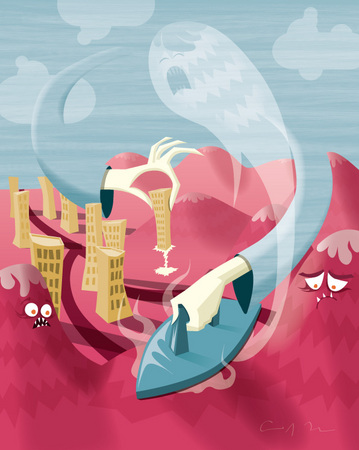
Two sky arms develop the land, ironing away the mountains and electrically binding buildings to the flattened earth. (Illustration Friday, topic: electricity)
I'm really not sure about this one. I had to finish it on my 12" iBook G4 because Adriana and I went out of town this weekend. The colors on the iBook are really hard to gauge. Creating something like this on a computer of this caliber is a brand of masochism I'm not eager to soon repeat. I'll probably go back in and fix it when I'm on my home computer.
ack! i LOVE it, the colors work very well together...great piece! :)
Great sweeping energy to this..Like the modeling of the hands and the individual elements playing off of each other visually...I hate doing the color adjustment thing too when trying to do prints. It can be a nightmare doing it from vector programs. I import a flat version into Photoshop for a template then import individual elements(maybe grouping a couple) on individual layers and place them so I can have more control on individual color adjustments. It kind of stinks if you want to go to a larger size (if you don't redo the entire process you get the standard pixelation). Do you do your color adjustments in the vector program...if so do you have to go in and select and change individual colors?
Not sure? I think the colors are perfect! Such a fantastic combination! The whole thing is lovely: the composition, the textures. I love it.
Actually leave it alone! I like it.
It reminds me more of Edvard Munch than of your usual influences...
It's great, except for the little squiggly line at the bottom.
Awww... poor mountains. What a creative idea to iron mountains. Very nice shapes and sweeping composition.
That is one way to get rid of spermy mountain souls. Another, of course, is club soda.
Re-Captcha says: Synthetic 75. My new favorite!
I'm a big fan of this one. Seems like a Mother's day in Hell. Forced to return from the grave for one last pass on the wrinkles, the pain of her chore is not lost.
it's fantastic as it is! i really like the worlds and characters your create, chris :)
I like the colouriffic harmony of this one, how it suggests that, just like in the singles scene, pretty can very well equal dangerous.
I'm glad to see that it is finally a time of renewal for one of your cites. Even though there is violence in the form of some good-ol-fashioned mountain ironin' going on too.
The mountain on the left seems so shocked that the chickens have finally come home to roost, that sweeping change has finally happened, whereas the one on the right seems to be resigned to it. If only the seemingly immovable impediment to progress that is the Right in this country could be so accepting of their time having long-ago passed; if only they would simply shut the hell up and let themselves be ironed away by the renewing forces of progress.
Sigh... Good stuff.
Thanks for the votes of confidence on this one, everyone. I'm a little more sure about it now. I meant to mention it earlier, but Alex deserves a little credit for the color on this one. He entertained my long distance call and email in order to help me out by checking the colors on his monitor.
WARNING: long, boring, technical discussion ahead.
As for Brian's question about adjusting colors, I do everything in Adobe Illustrator. I work on a big, bright, high-quality LCD made by a company called ForMac (incredibly creative name -- not sure if they're still around or not), or, as Alex calls it, my "Univision TV" (the ForMac logo is painfully similar to that of a certain Spanish language network). The color accuracy on the ForMac monitor is very good, the monitor's only real downfall being the over-brightening of dark shades nearing black. It shows too much separation and contrast between shades at the dark end of the spectrum, so sometimes I'm fooled into thinking it'll look good printed when, in fact, my shades are too similar and everything ends up being very dark or black. The iBook I have is a great little computer in many ways -- it's literally been around the world with me -- but it isn't cut out for serious graphics work at any level. It's extremely over-bright (turning down the brightness doesn't help with over-bright LCDs), it's got a very limited color spectrum, and the contrast is WAY off. You can't really calibrate it out, either. It doesn't really show during normal use, but when I'm using Illustrator or Photoshop, the limitations are laid bare.
As for bringing individual pieces into Photoshop, I tend to shy away from rasterizing my vectors. In Illustrator, there are a bunch of different ways to change colors. Clicking on individual items and shifting their colors is one way, but it's tedious. The method I use most frequently is Select --> Same; you click on one item with the color you'd like to change, choose Select --> Same (fill, stroke, etc.), and change the color on all items using a specific color. CS3 offers a select same button above the work area now, making this method even easier. The "professional" method is to create global swatches before you start working with certain colors -- that way, all you have to do is shift the color of the swatch and everything just changes, no selecting necessary. Admittedly, I'm not really good about setting global swatches (bad excuse: it kind of breaks up my workflow), so I don't use them as often as I should. There's also the Magic Wand tool, which selects colors in a method similar to Select --> Same, but can be tweaked to select a range of shades as opposed to one exact color. Magic wand is really great for selecting same blend modes and levels of transparency.
In the end, what all of this gobbledy-gook means is that I do everything -- EVERYTHING, start to finish -- in Illustrator. I know eventually I'll incorporate other outside elements, but for now, I'm trying to see how far I can push the program and just how much I can squeeze out of it.
I call it your Univision fancy TV...
And trust me, folks, it is fancy!
Gooooaaaaalll!
Chris,
I like the colors of this piece very much.
I also love the sad ghostly sky-face.
How EVER do you get that lovely sky texture in Illustrator?
I do a lot of vector illustration as the resident "illustrator slash art director"...
but those textures! Wow!
And hey, thanks again for your kind comments...
they really make my day!
Denise
Thanks, Denise. I figured someone would eventually ask about the sky textures. Without getting too specific and giving away all of my secrets, here's a BASIC technical breakdown of my method: I draw a pattern, stretch it, make it a brush, and then I brush it on, usually lessening the gauge of the stroke and bringing the opacity down. Also, I make sure the original color of the pattern is black so I can employ the "Tint" function of the brush, allowing the brush to take on the stroke color chosen in the color pallet.
That is so funny that you were worried about the colors, right when I saw it I gasped (well almost, I did in my mind) because I LOVED the color so much... love love love!
Love your characters-- they're so expressive and fun. Great work!
Argh! What's wrong with leaving a few lumpy, carnivorous mountains lying around?!? I'm gonna agree with the consensus here. The colors are spot on. Love the texture in the sky, and the whole concept. The mountain having a soul is very cool, very shinto.